Generating App Store screenshots in nine languages with Remotion
- Published on
Kosshi recently grew to nine languages, which means the App Store screenshots now need to exist in nine languages too. Last time it was about the inside of the app; this time the same work came around for the outside, the store page.
And it needs separate sets for iPhone, iPad, and Mac. Nine languages times three devices, times the number of shots per set, comes out to well over a hundred images.
You can absolutely make them one by one, by hand. Plenty of apps do exactly that. It's just, plainly, a lot of time. Every time you tweak one line of copy, you reopen nine languages × three devices' worth of files, fix them, export them, and the motivation drains out of you a little.
Last time I wrote about editing video with Remotion, so in that same spirit, I wondered whether I could spit the store images out from code too. It worked better than I expected, so here's how it went.
I wasn't really being found
A bit of background: the reason I did this at all is that Kosshi was barely getting downloaded outside Japan.
When I looked into why, it turned out to be pretty fundamental. Search the App Store in any country for the words you'd expect, and Kosshi mostly doesn't come up. On top of that, at the time, a misconfiguration on my end meant the site wasn't even showing up in Google. And I've done essentially no marketing aimed at people abroad. There was, basically, no way to be found.
Even so, there are people who installed it anyway. I assume there are a few search terms it partially surfaces for, and they found it through those. The numbers can't be large, and somehow that makes me all the more grateful they showed up.
The reason I haven't moved on the international side is partly that I'm bad at selling, and partly that I'm still genuinely unsure which channels are worth it. I'm thinking of putting it on Product Hunt this weekend, but every other form of promotion I can think of makes me a little uncomfortable. Still, for the people who do find their way here, I'd at least like things to be set up so the app comes across properly, in their own language. The store images are part of that "getting ready for whoever shows up."
Not just a pile of screenshots
In that spirit, I reworked what's actually in the images this time too.
Kosshi's old store screenshots were, honestly, close to just the app's screens lined up. The screenshots were there, but whether anyone looking at them could picture how they themselves would use it was iffy.
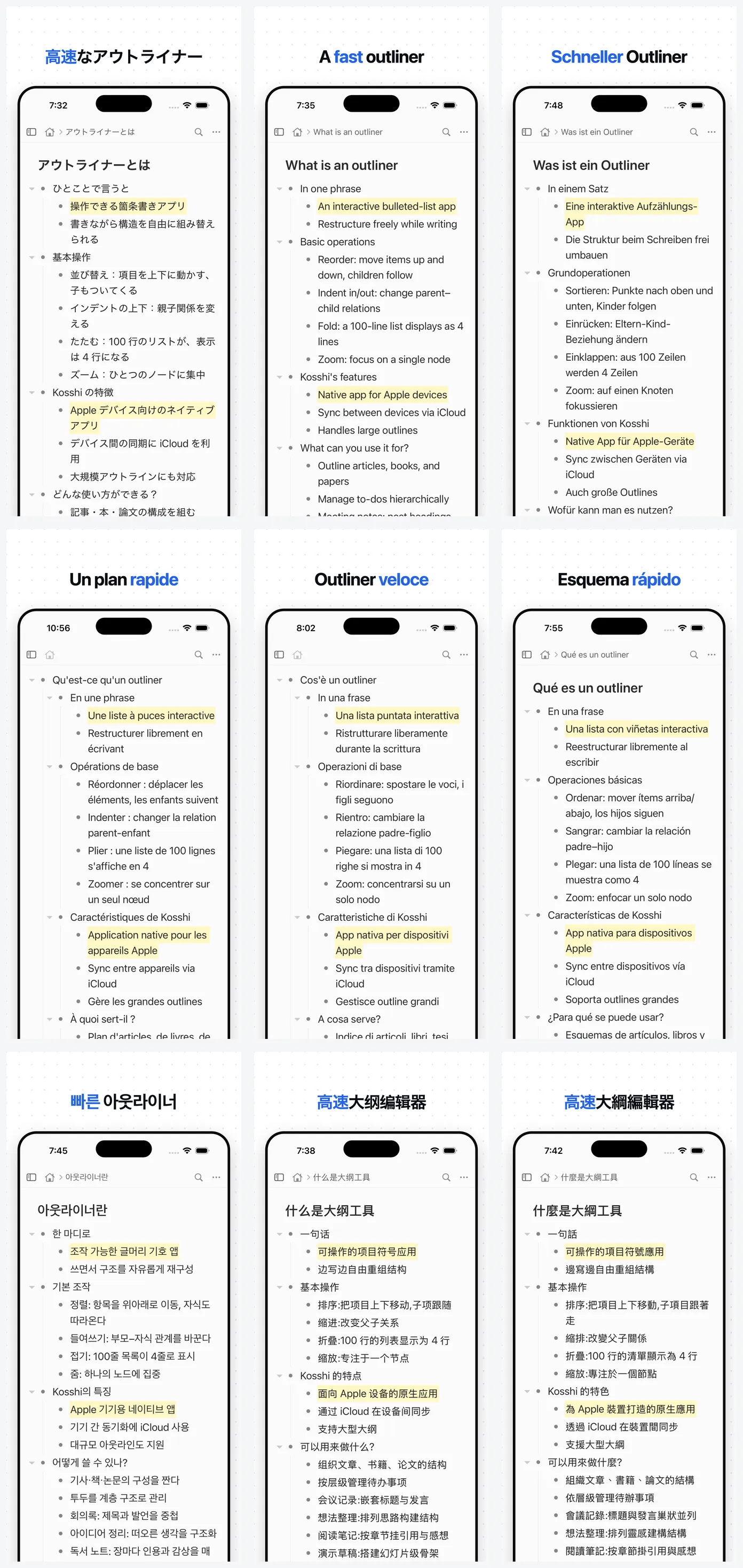
So this time I used a little imagination. Where is someone who uses this app, and what are they doing? Holding that in mind, I made each image carry one way of using it. Writing in the outliner, styling text with Markdown, managing tasks, dropping in images and files, syncing across devices. Go through them in order and you get a rough sense of the whole thing. Less a pile of screenshots, more a little demo of how it's used.
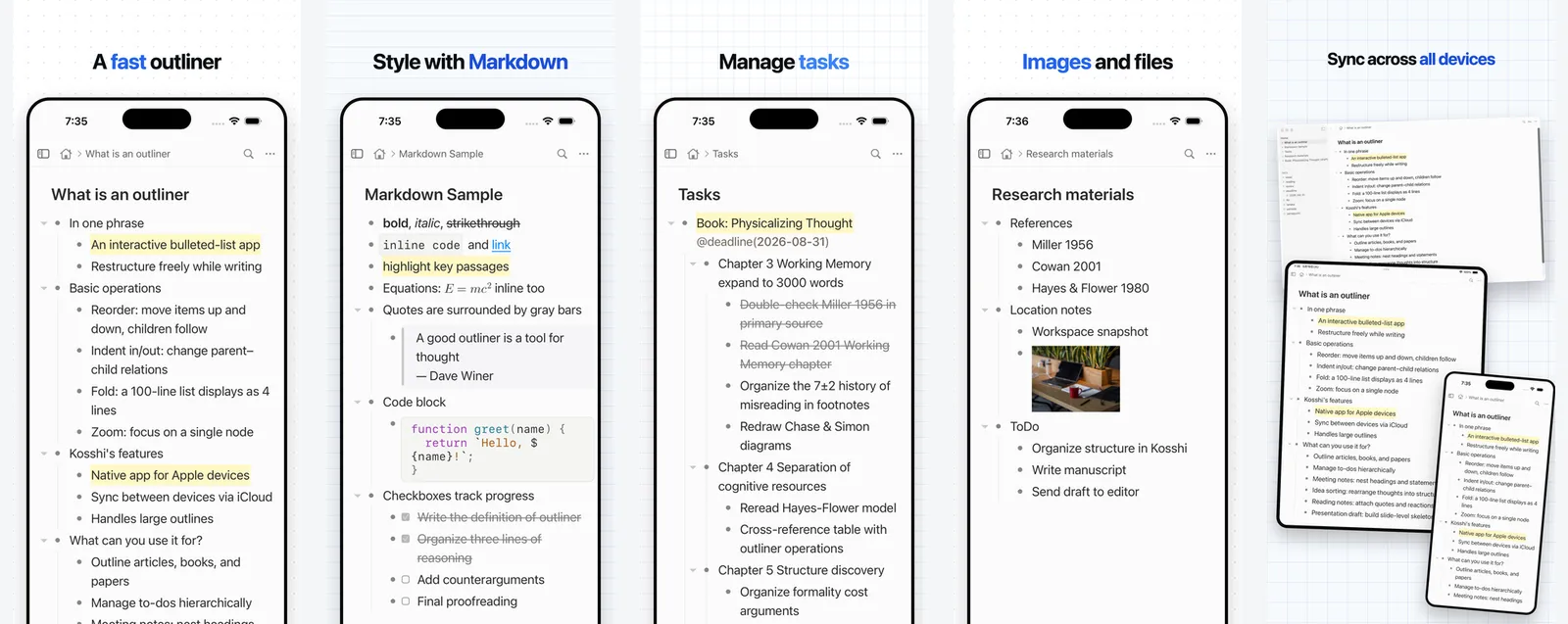
I went back and forth on the background, too. I tried a few colorful ones at first, but none of them sat right. Kosshi itself is a plain, fairly understated app, so making only the surroundings flashy left it looking out of place. I ended up with a notebook-like background, ruled lines and dots. I wanted it to quietly say: this is an app for writing.
Making images with Remotion
Remotion is a slightly unusual tool: you write code, and out comes a video. The last post was about that video side.
The thing is, Remotion can also export just a single frame as a still image, not a whole video.
An App Store screenshot is, really, "the app's screen, framed nicely, as one image." Lay down a background, place the device frame, put a headline on top. That, I figured, I could assemble from code the same way as a video.
For what it's worth, there are proper, dedicated tools and services for making App Store screenshots out there. Using one of those would have been the sensible move.
I went with Remotion anyway because a kind of homegrown system had built up around the video, and I figured I could reuse the device frames and the Kosshi-ish background and headline design as-is. In practice, far less of it carried over than I'd hoped, and I ended up rebuilding most of it from scratch. But the way of making it (building images with code) is exactly the same as the video. I didn't pick Remotion because it's the best fit for images; I just carried over a way of working I was already used to.
Here's what actually comes out:
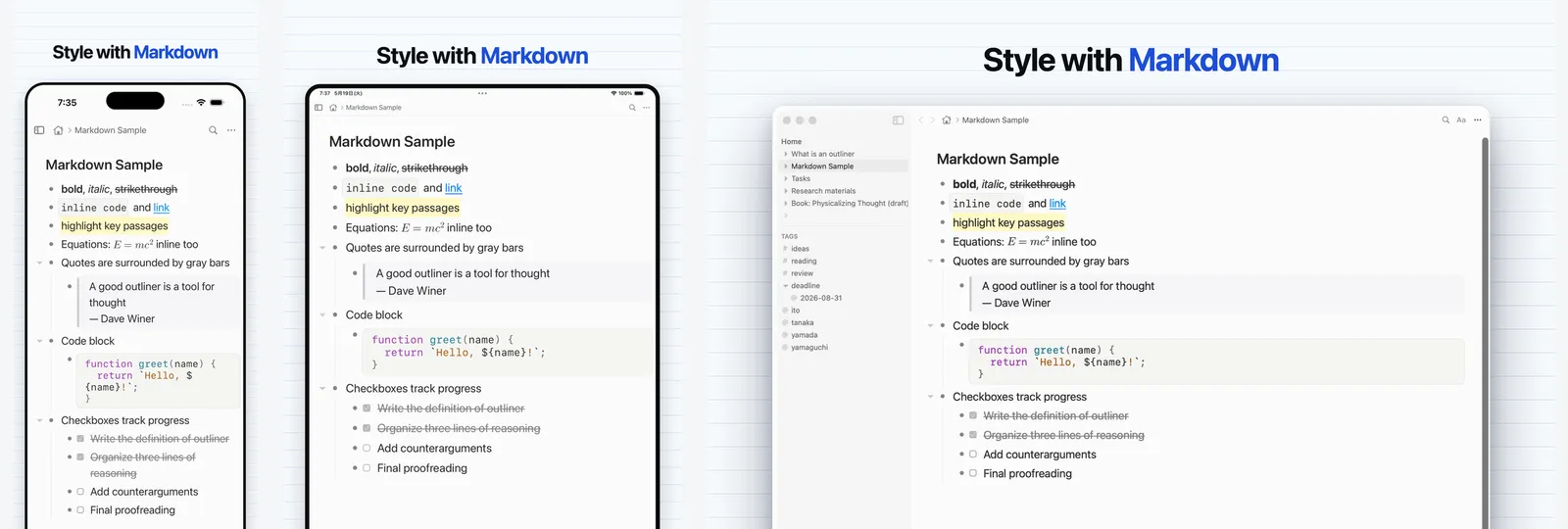
The background pattern, the headline, the iPhone frame: all of it is drawn in code. Only the app screen inside gets swapped out, and the language versions fall out from there.
The iPad and Mac sets come out the same way. The required sizes differ, but the method doesn't.
It gets easier the more there is
To be honest, the first pass is genuinely fiddly. Setting up the template, writing copy for nine languages, matching sizes per device: getting it off the ground takes real work. I'd look at what came out, fix the design, export again, and go back and forth like that more than a few times. If you only ever needed one image, laying it out by hand in something like Figma would probably be faster.
But where this approach really pays off is exactly the "different languages" part. Each device needed its own layout, sure. Once the template exists, though, going from one language to nine is mostly just swapping the words inside. And the design fixes (I made plenty) propagate everywhere from a single edit. The weight is all in deciding the shape the first time; after that, adding languages barely adds work.
Back with the video, I wrote that once you turn something into a system, the next time gets easier. These store images turned out to be one more case of that, the kind where it gets easier the more you scale.
Related posts
Editing video by writing code is more fun than I thought
I was building an explainer video for Kosshi with Remotion, and the codebase quietly grew to 12,572 lines. Seeing 'refactor' commits in a video repo turned out to be more fun than I'd imagined.
I dropped the contact form and put up my email
I recently changed how people contact me, from a form to just my email address. It started with a small thing that had been bugging me. People come in through a form, but I reply by email. Once someone writes through the form and we move to email, the next time they want to reach me, they're not sure which one to use. The form again? Or just email me? Eith
I started a newsletter for Kosshi
A while back I wrote that feedback for Kosshi had started pouring in over email. That hasn't let up, and I've been living in my inbox ever since. The thing that kept bugging me was simple. I can reply to people one by one, but I had no way to tell everyone using Kosshi, "hey, this is changing." I keep a release-notes page, and I post the occasional "just s
Mostly a weekly summary of new posts, sent about once a week.
You can unsubscribe anytime from the link in any email.